Data is stored everywhere around us. It depends on us to use all available sources to create a useful set of information which will help us drive our business forward. The data was around us since the expansion of the world wide web, but only recently did technology evolve enough to provide us with the right tools for gathering, modeling and presenting key information.

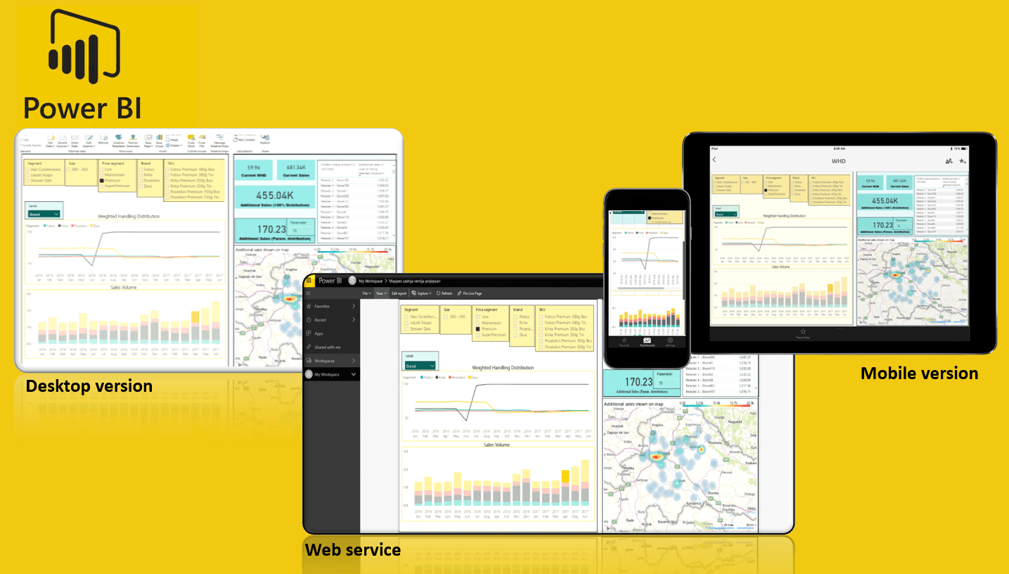
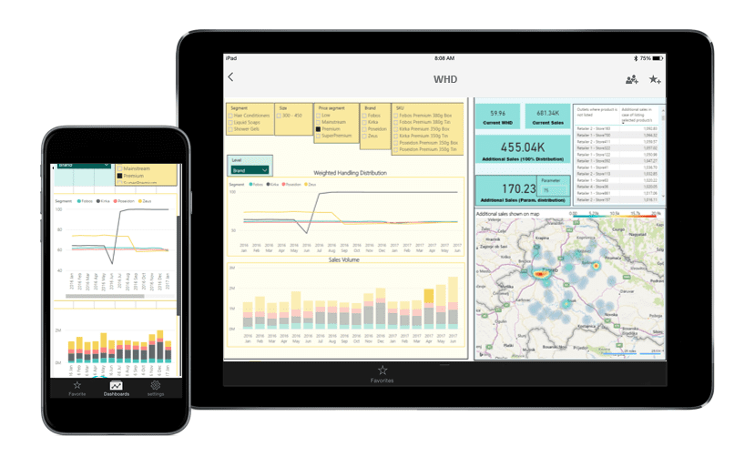
One of these tools is PowerBI, Microsoft next-generation data cruncher and insights provider. With this tool, you can quickly combine multiple sources of data into highly interactive dashboards which can be easily shared across the whole organization, and accessed either through desktop laptops, tablets or mobile phones.
The dashboard below is just a simple introduction to how publicly available data can be turned into an excellent tool for data analysis. At the moment the dashboard shows moving averages of Temperature/Rainfall in Croatia and has no real added value except it is nice to see and fun to play with. But if you are a retailer owning lots of kiosks, then you most certainly know how weather can influence your overall sales. You could always blame the weather for bad results, but could never really quantify the weather impact and be able to adjust your sales to see if your volumes are solely dropping because of weather, or there is something more to it.
Many manufacturers in the Retail industry are also highly dependent on weather conditions (like manufacturers of ice cream, soft drinks, beer, water…). For them, it’s crucial to be able to quantify weather impacts on their sales, not just to say it’s the weather to blame. To implement this analysis into a company data in the past would require significant resources and someone with high IT skills. With PowerBI you can simply import weather data into your data model, link it through relationships with company sell in data, and you are ready to go.
*Please find below the Interactive Weather dashboard. Feel free to click on any part of the dashboard to see how it feels and behaves! 🙂 If you access it through mobile platforms, please choose landscape or full view. The report is not optimized for Firefox browser.
Since PowerBI is a data modeling tool, you can easily add multiple different sources into your model, each providing you with an incremental value. You can call these sources different modules, which, once imported, can always be used for analysis, included in dashboards or be used to build greater models upon them. Just imagine that your employees can now create superb interactive models combining every data they could think of.
You could have a dashboard where you have company sales data right next to consumer and retail research data (like Nielsen panels and consumer research brand awareness or trial levels). Below that you could have brand&trade activities by scope and place, alongside with weather impacts. Every piece of data would be connected, so when you choose one brand, only figures for that brand would be shown in all charts/tables mentioned above. With the next click of a button, you could dive into a certain region and all figures would adjust automatically. You could have all the company data at your fingertip. How great is that!? And nowadays it has become a reality.

While playing with the interactive dashboard above think of all the possibilities that can be achieved with this new technology.
Hope you enjoyed reading the article! If you have any questions, please comment below, and if you liked this article, don’t forget to Share/Like!


