So far I have written a couple of articles about PowerPivot, PowerQuery, and DAX. The reason I started my blog with these topics, and will continue to do so, was to get you all familiar with “New” technologies that are coming our way and that are redefining our understanding of Data extrapolation and data analysis. The one thing is certain. The whole industry is shifting from the IT approach to the Data Specialists approach!
>
Reporting systems – the old way
A few years ago, it was almost impossible to create a slightly advanced dashboard or analysis without the help of a programmer and database expert. Before technology started the transition from IT approach to Data Specialists approach, most of the time you had the following scenario when you wanted to change/implement new reporting system in your company.
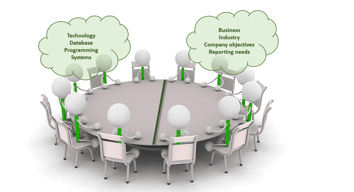
First, you would need to get all the involved parties at one table. Once gathered at the table, these people would discuss changes of existing reporting systems or creation of new ones. On one side of the table there were people from IT sector, knowing everything there is to know about technology, the program possibilities, and database relations. On the other side of the table there were people who knew everything about the business, their needs and what they “want” from the reporting system.

The idea was that business people would clearly state what are their expectations from reporting system and that IT people would understand all their needs and deliver solutions which would be comprehensive and attractive. But most of the time this was not the case. I have seen reporting systems which were presented as game changers, only to see them fall on the margin and to be used by the few colleagues in the office, mostly for the purpose of extracting data to Excel or some other spreadsheet.
What are the main reasons behind this behavior? Why most of the reporting tools experience the same lack of interest from the broader audience and sooner or later gets forgotten? There could be several reasons, like the new reporting systems have a steep learning curve, the user interface is bad, lack of flexibility etc.
But the most important reasons why they fail is the fact that they do not tell a story in an easy and fun way!
The shortcomings of the old way
I have used many reports and dashboards where on the first report page you have nicely presented all the KPIs important for business. Now you want to explore why one of the KPIs is showing bad performance. You go to the second page of the report and get poked in an eye with a huge table containing all the information you need. OK, you have all the data in that report, you just need to create a report from data that you found in a report. Sounds great, right?!
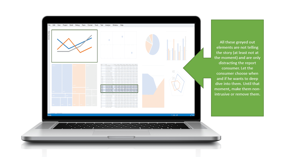
I have also used reports with more than 10 pages all filled with different kinds of analysis. When you get to the 3rd page of the report, you’ve already forgotten what were you trying to investigate. One of the most important advice I’ve received from my superior when I was working on one of my first dashboards was “Less is more”. If you have 10 pages in a report, and you are only using few graphs and one table, then all the other elements are distracting your attention and are making you less efficient. They are not telling a story and that is the reason why you should either try to incorporate them in an intuitive way or get rid of them.

Now a new question arises. If they are not telling a story, then why are they there? Somebody must have thought that they would be important, otherwise they would not include them in a report.
That someone were the people sitting at the table when reports/reporting systems were discussed. The problem is that the business guys knew the end result they wanted to achieve and what is important to track and analyze. The IT guys knew exactly how to show the end results and how to provide Business guys with all the needed info. The part that didn’t click is the journey from the moment you open a report until you get the end results.
Without this part, the end result is just a big pile of numbers with no real story behind. You see the results but you don’t understand the reasons behind them.
Ingredient missing – the journey
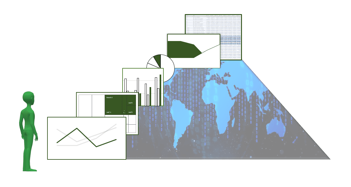
When creating dashboards (no matter if they are Management or Executives), you have to have in mind that every single table or chart in a report must be a part of a story that could be told by navigating through it. The navigation has to be fun and engaging. And the most important, at each moment of analysis, the consumer of the report has to know where he is, what is he looking at and what he should expect next. It has to be Intuitive!
To create these kinds of reports, you have to have a solid knowledge of company and industry in which the company is present. It is really hard to understand the dynamics of how each company works, data importance, ways the data should be analyzed and presented. This is hard even for the business guys and almost impossible for the IT guys which are often an outsourced company. The result of mixing IT&Business guys is that the reporting systems are done in a way that they satisfy the business guys requirements without the journey part. The reason is that the journey part can only be created by a person who understands business and knows how each graph/table in the report should complement the total story.

Indeed, you need a data analyst people to create that journey from BigData to Insights in an intuitive, easy and fun way. I’ve mention fun part couple of times. Yes, it has to be fun to drill through all that huge mass of data coming from various sources! Because if it isn’t fun to do it, then people will stay away from it. Soon the job will fall into a hand of few guys that will do it only because they need to do it, not because they want to do it. And you don’t want those guys to tell you insights about the company and market possibilities.
In order to make it fun, the journey momentum has to be created from the period someone opens the report, to the moment he gets the needed insight. It’s like creating a presentation, but you leave the author with all the possibilities to create his own story, while report guides him in a simple, intuitive way.
If you are responsible for report delivery, in each step of report creation you have to anticipate what could be the next question, then provide a non-intrusive and cascading way for the report consumer to investigate further causes. If at any step of your report journey you stumble on a big table, unclear chart or redundant data, you need to work that part to make it simpler and easier to use and consume.
When I was creating reports for my colleagues I always had these ideas in my mind. But to implement an idea, I first needed to understand business and my colleague needs. This is the crucial part where the outsourced IT company can never match the business guy who comprehends company figures.
Good to remember is that people are visual beings, so always prefer charts over tables, but also provide the possibility to get a table if needed. There are many more guidelines on how to create journey momentum, but I will cover them in one of my next articles.
The IT and Business guy in one
Until now journey part was hard to implement in a company. IT and Business divisions were two different worlds, and it was almost impossible to have people who understand both worlds enough to create this kind of reporting system. To tell you the truth, each company has employees which are able to create great intuitive reports. Then why are they still stuck on old reporting systems and mostly doing data extractions instead of data analysis? I will note just a few reasons.
- They think they are not skilled enough to create advanced reports,
- They think that they would need technical support during the implementation,
- They lack ambition and proactiveness (often correlated with a doubt about their skills),
- They think it will consume too much of their time, not realizing that in long turn it will save them time and make them more efficient at work.
- They think that refreshing of these reports will take a significant amount of time and that nobody will use them.
These are all false doubts. With the evolution of the technology, reporting has never been closer to the analysts and business guys who know how to use data in a productive way. If you consider yourself a data person, no matter what is your current position in a company, you can bring that difference. Maybe not at the first attempt, but sooner or later you will produce an excellent report/reporting system which will be used by most of your colleagues. While creating your own reports, you will get a deeper understanding of how business works, your creativity on workplace will go up and, the most important part, you will get exposure to people above you who will most certainly notice your will and proactivity, which will boost your possibilities for professional career growth.

At the start of the article, I’ve mentioned my previous articles about PowerPivot, PowerQuery, and DAX. Yes, these are the next generation tools for data manipulation and analysis, but there are also other BI tools that could help you create organization driven intuitive reports. The reason why I put an emphasis on mentioned tools is the fact that they are all used to expand the capabilities of Excel, program in which analyses are done in more than 80% of companies worldwide. This makes it much easier for data analysts to adopt new “BigData” features under a well-known Excel interface. An additional benefit is that, once you master these tools for Excel, you can apply all of them to the PowerBI (Microsoft business intelligence software). It is stated that PowerBI will be the leader in BI tools in future (besides Tableau), so this makes it a great investment of your/company time and money.
No matter which platform you choose to start data consolidation and report creation one thing is safe to say. You should start investing in these technologies right away because, in near future, all departments in a company will be under the strong influence of data, they will all need their data analysts. There are many predictions about the most demanding jobs in the next 10 years, and in all of them, the data analyst is in the top 5. 90% of people working in big companies will, in an extensive amount, depend on data and their ability to quickly transform data into insights. The future is near, and we should all start adjusting to it.
Wrap up
The old reporting systems are slowly being replaced by the new BI approach targeting data specialists. The main idea of the new approach is to bring data closer to the business guys, building a synergy between company employees. People who understand business can now create advanced reports that are easy and fun to use by the broad audience, helping the report consumers get insights faster than ever.
The main part that was missing so far was the gap between an IT guy and Business guy (the journey), but with the new technologies, this gap is smaller than ever, providing a great opportunity for companies that adopt on time.
Hope you enjoyed reading the article! If you have any questions, please comment below, and if you liked this article, don’t forget to Share/Like!


